


 Contact
Copyright GK Dynamics Inc., All Rights Reserved.

Copyright GK Dynamics Inc., All Rights Reserved.


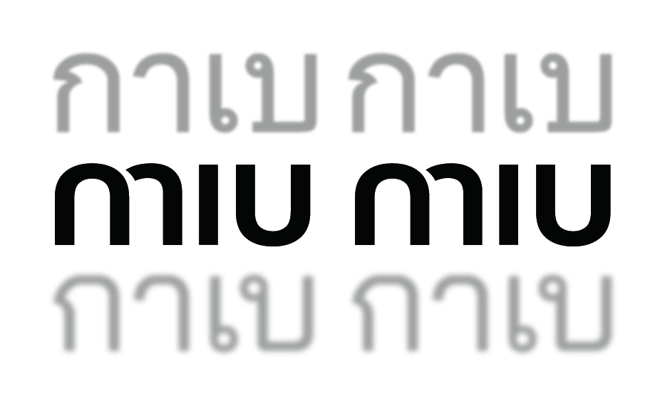 What comes to mind when you look at this thumbnail? I guess you associate it with the fashion brand Miu Miu.
To tell the truth, this image, which simply consists of Thai characters, can be pronounced as “gābegābe.” In fact, Thai people say they naturally pronounce it as “gābegābe.”
This logo design of Miu Miu (miu miu) has three specific features that makes it look like a Thai word. First, it all consists of lowercase alphabetic characters. Secondly, the Thai language has simplified character system. And thirdly, the letter “m” in this logo is designed with a slit. Because of this slit, “m” appears to be a combination of “n” and a mirror image of “r,” which allows Thai language speakers to pronounce this letter as “gā.”
When we design a logo, we usually pay careful attention to using characters that are hard to make out. The story behind this Miu Miu logo reminds me of the importance of having multiple viewpoints as a designer.
By the way, isn’t it interesting to find how designing a logo unintentionally spawned a new way of pronouncing it? This logo design, with the aid of its character shapes and insertion of a slit, started to relate a quite different story on its own in Thailand without attributing any concrete meanings at all.
This is a piece of trivia that makes me wonder if there are more examples of interesting designs that can produce unintended results.
Norio Katahira
CMFG Design Dept.
Unit Leader