ベイサイドブルー
横浜の青 ベイサイドブルー
2020
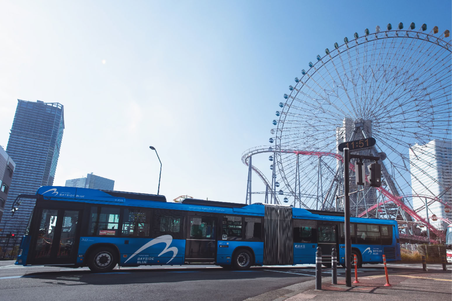
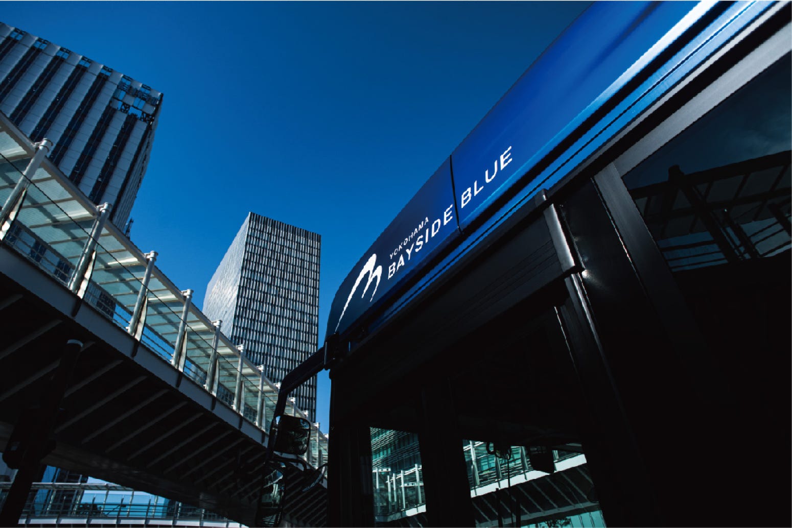
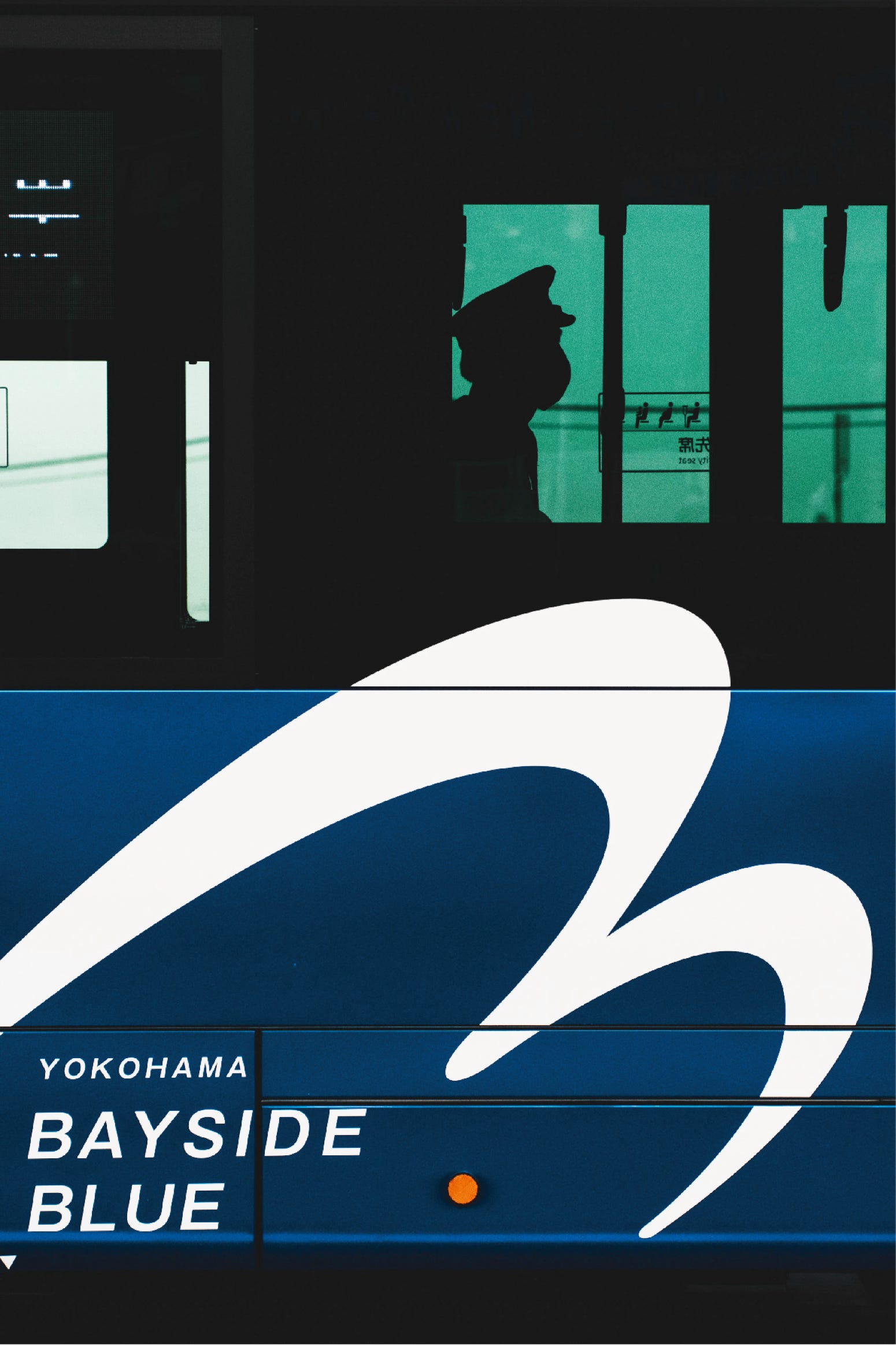
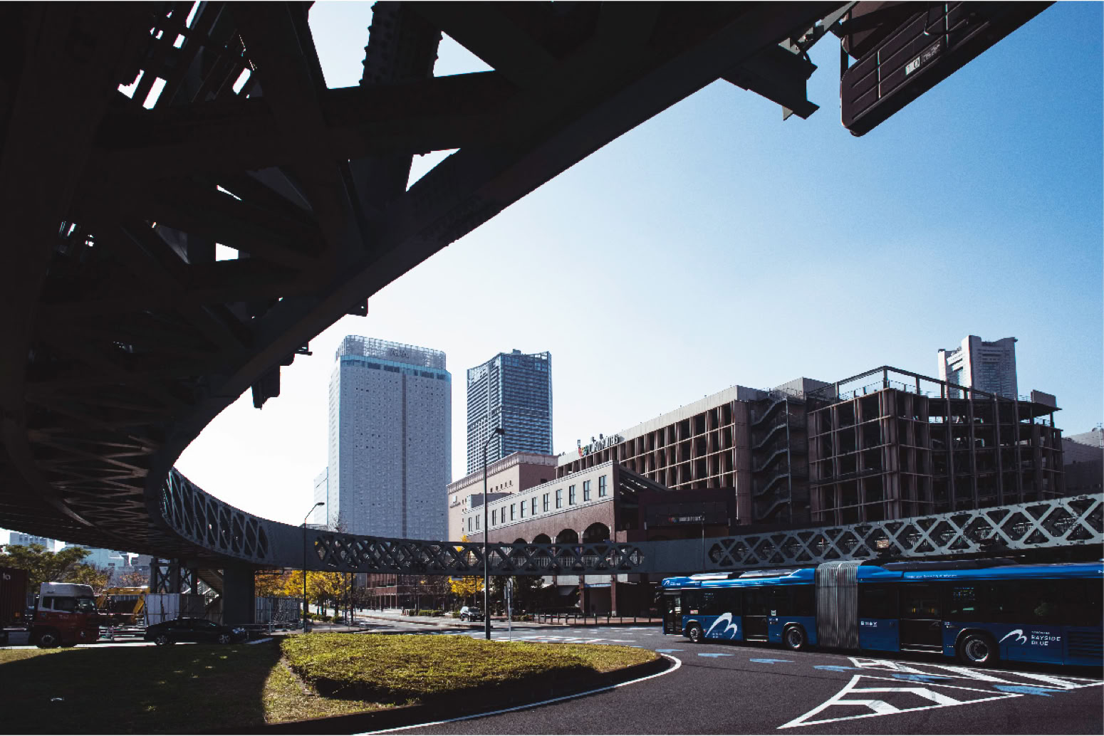
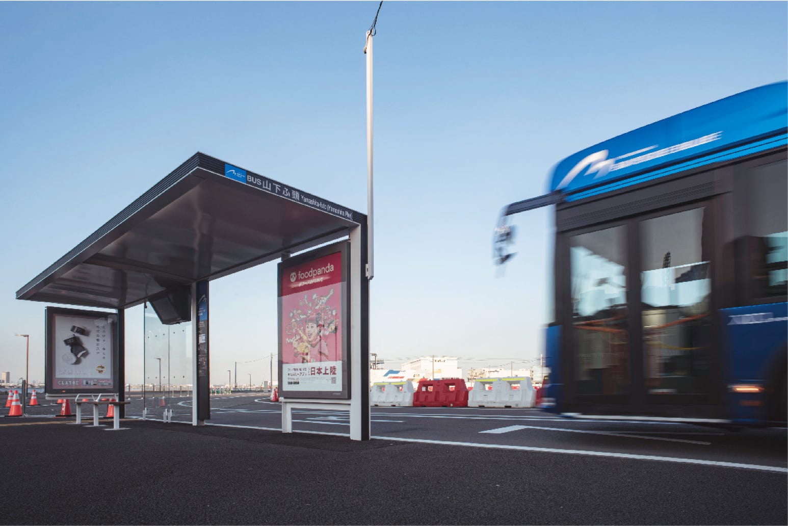
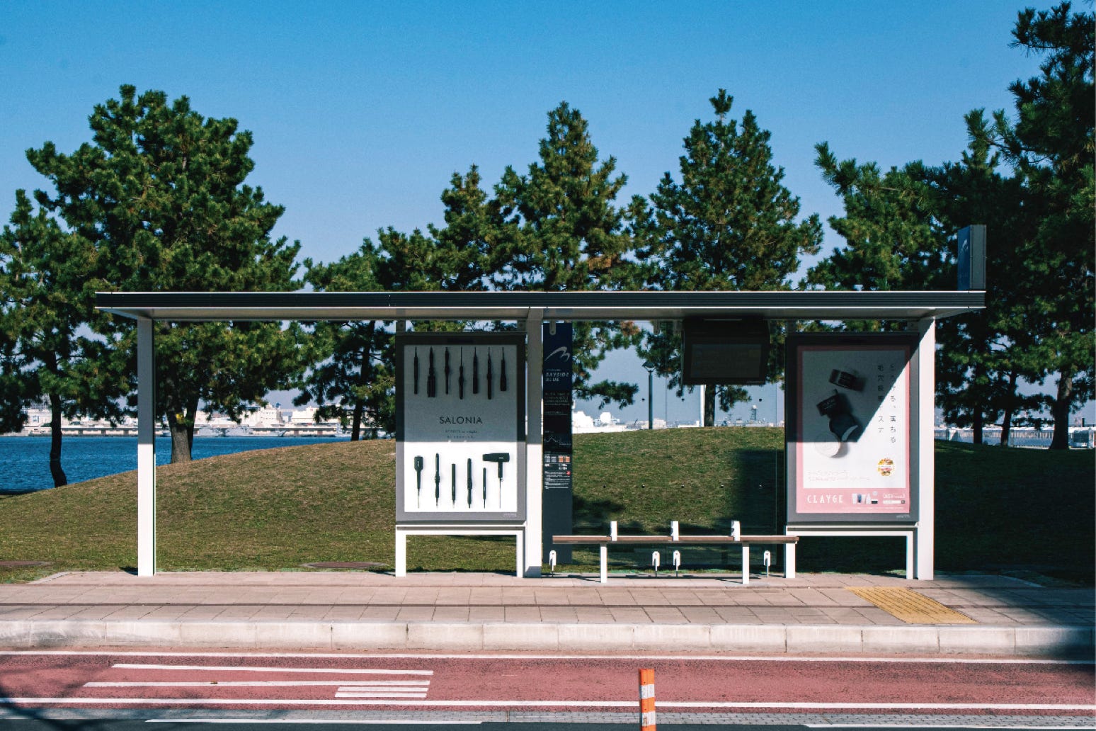
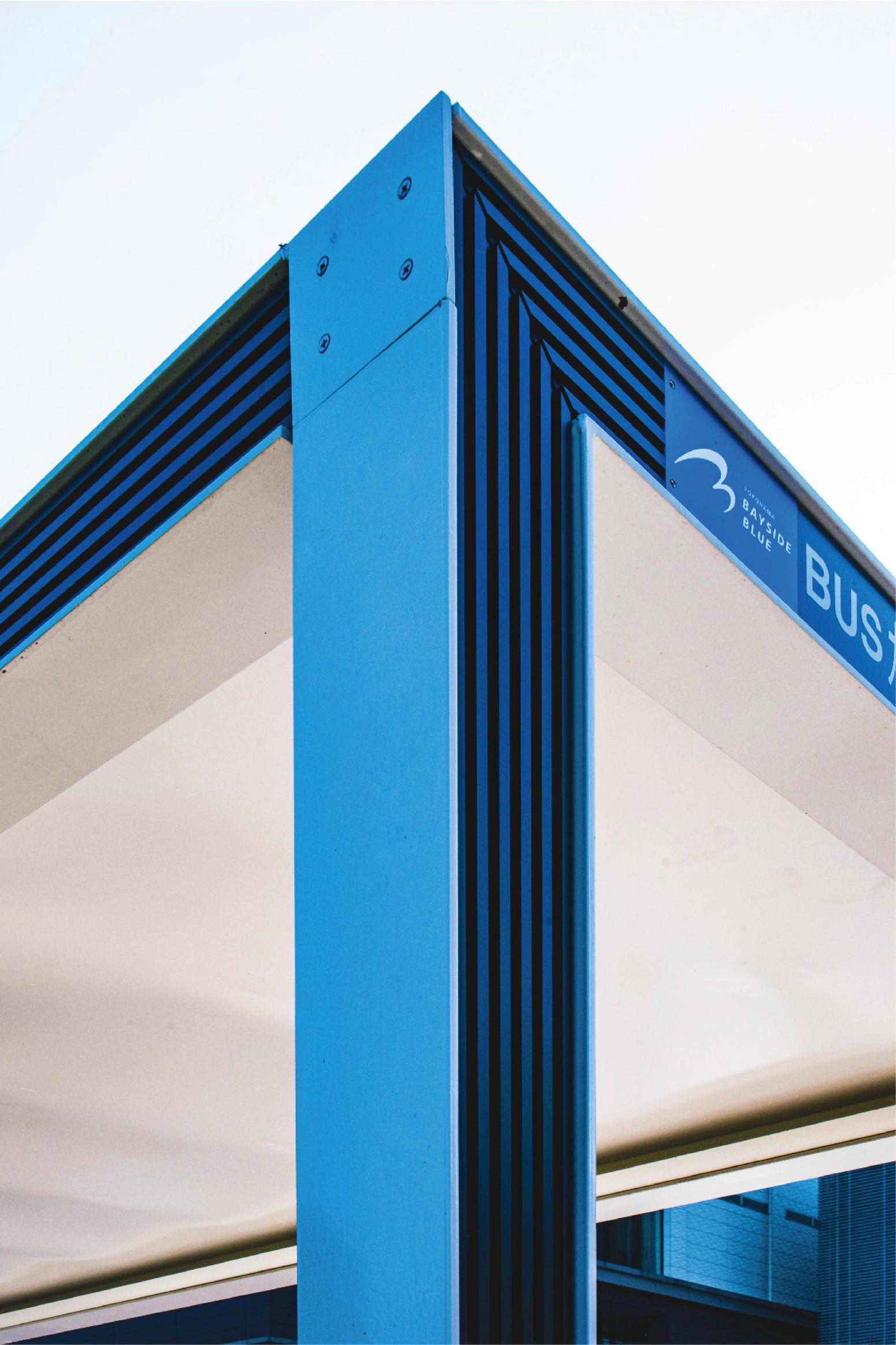
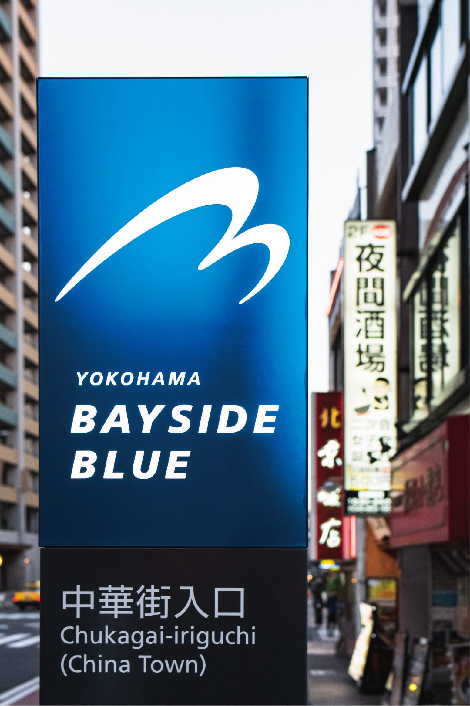
横浜市都心臨海部の再開発に伴う、公共交通の新たな施策を受けて新設されたバス路線に導入された、ハイブリット連節バス。国産の連節バスとしては、第1号となる。GKデザイングループは、車両外装カラーとシンボルマーク、バス停のデザインを担当した。外観カラーは、青に柔らか光沢を持たせたマットメタリックブルーで、横浜らしさを表現。青地に白く浮かび上がるシンボルマークは、移動する「2つの車体(連節バス)」をダイナミックな「2つの波」に見立てた。
This hybrid articulated bus was introduced to the route newly added in line with the new public transportation policy regarding the redevelopment of the Yokohama Central Coastal Area. The articulated bus is the first of its kind that is made in Japan. GK Design Group contributed by deciding the vehicle exterior color and designing the symbol mark and bus stops. The external matte metallic blue, a blue with a hint of shimmer, express the features of the coastal city Yokohama. The dynamic two waves in the white symbol mark represent moving twin bodies of the articulated bus.
領 域:公共交通デザイン
施 主:横浜市交通局
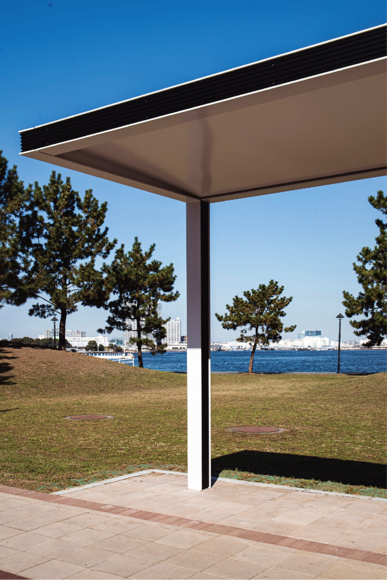
業務内容:車両外装カラー / シンボルマーク / バス停のデザイン(GK設計+GKデザイン総研広島)
写真撮影:橋本陽