新潟BRT トータルデザイン
2015
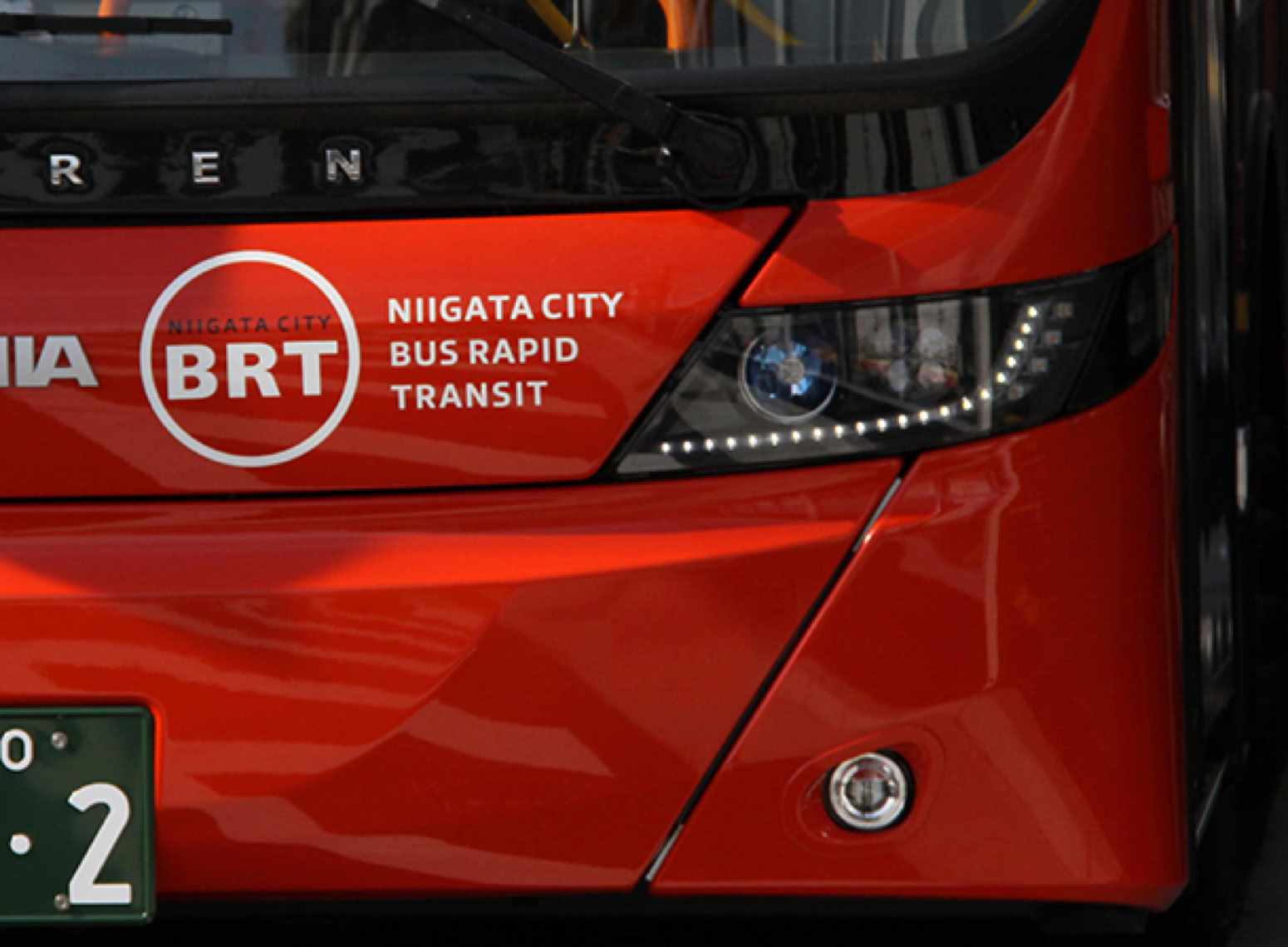
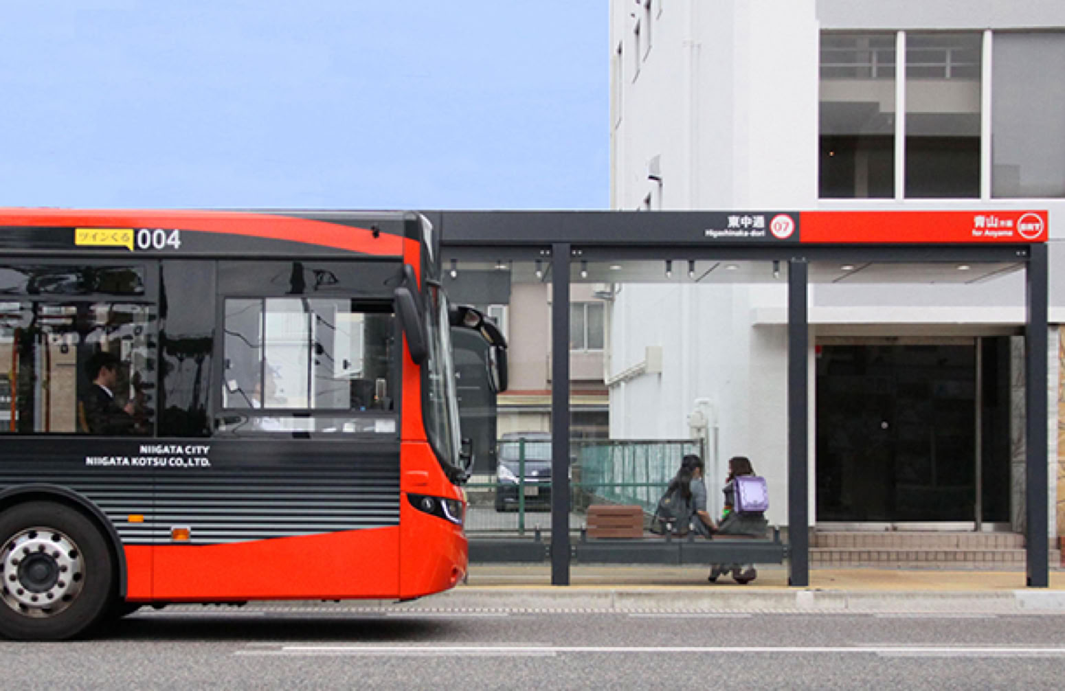
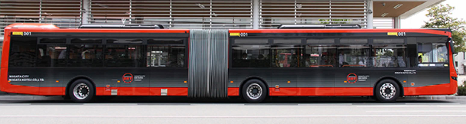
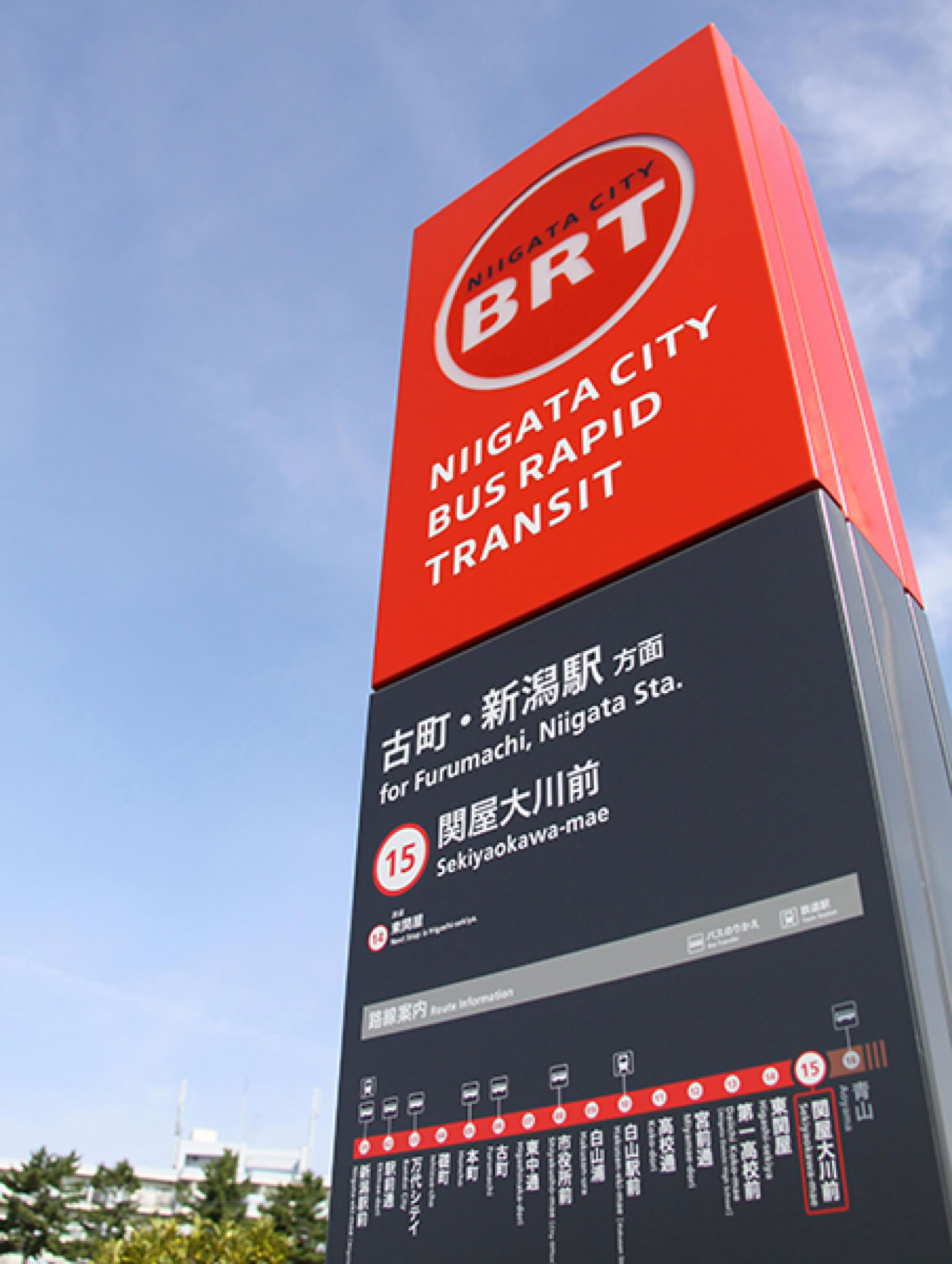
新潟市が、郊外と都心部を結ぶバス路線を再編し、都心部に導入する新バス交通システム「BRT (Bus Rapid Transit)」のトータルデザインを行った。
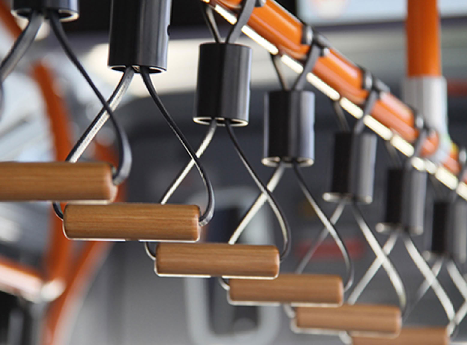
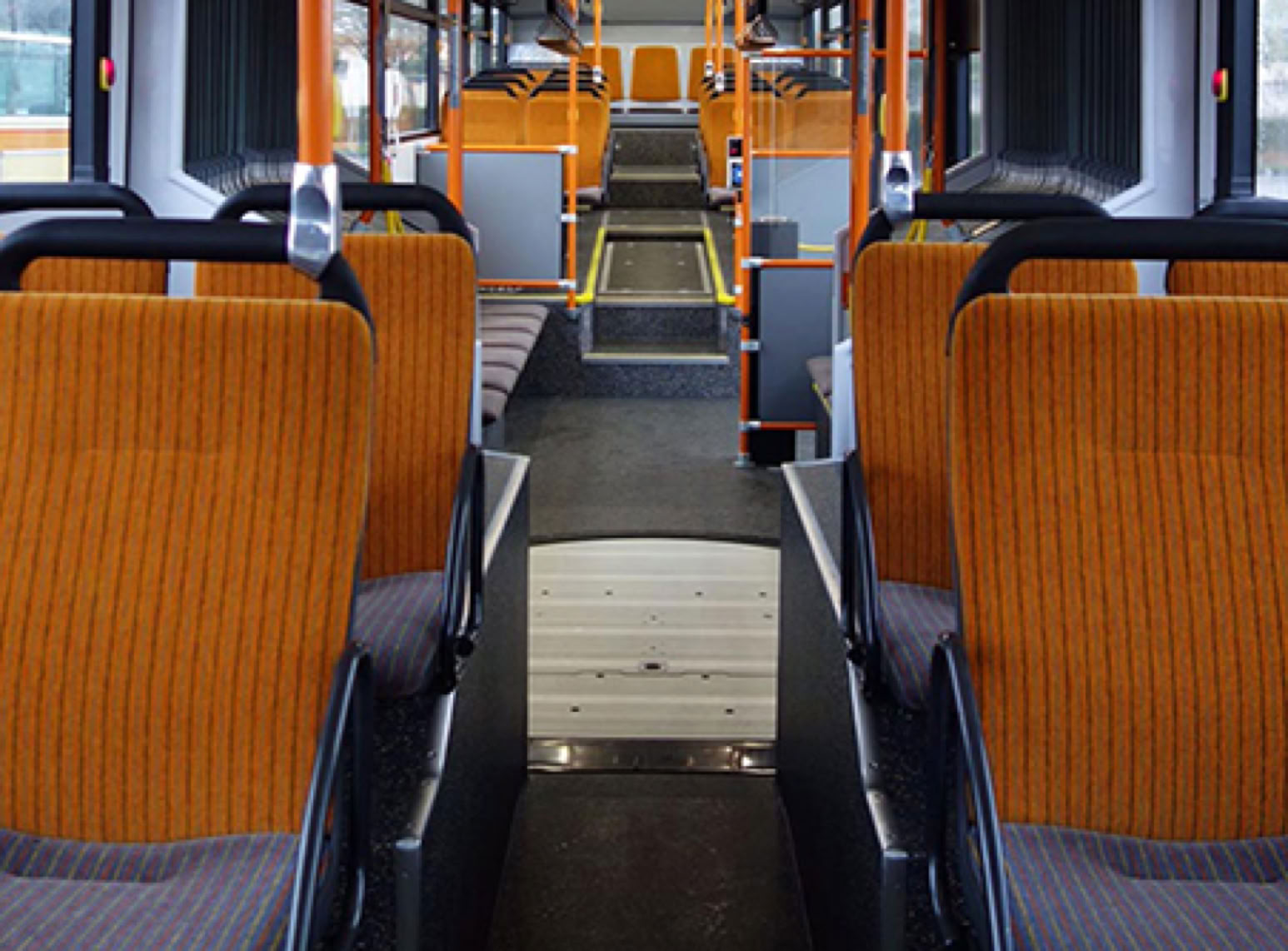
GKインダストリアルデザイン、GKグラフィックスとともに、連節車両をはじめ、郊外路線とBRT路線の乗り換えの交通結節点となるターミナル、BRT駅、シンボルカラーやロゴなどのデザインを担当した。
新潟の資源である夕陽をモチーフとした朱色をシンボルとし、明示性、快適性、地域性、先進性を基本方針に展開した。
Coordinated with GK Industrial Design and GK Graphics, GK Sekkei carried out the entire design as to the new Bus Rapid Transit system of Niigata City. The system is to reorganize bus routes connecting the suburb and the central part of the city. GK worked on the design ranging from trains, terminals, the BRT stations, symbol color, and logo.
Developed the design according to the fundamental policy on “clearness,”
“comfort-ability,” “locality” and “advancement” with the symbol color of the sunset for the motif as the prefecture takes it as a promotional resource.
Also in the design of the terminal, the node of transportation for transferring between the suburban lines and BRT lines, created the terminal space to ease passengers' stress for the change by planning the large scale roof, the waiting room and the like.
領 域:交通環境
施 主:新潟市/パシフィックコンサルタンツ
業務内容:基本計画〜基本設計、VIマニュアル作成、サインガイドライン作成、車両内外装デザイン
BRTの明示性、快適性、地域性、先進性