BUFFERIN A
BRISTOL-MYERS LION LTD. (Lion Corporation)
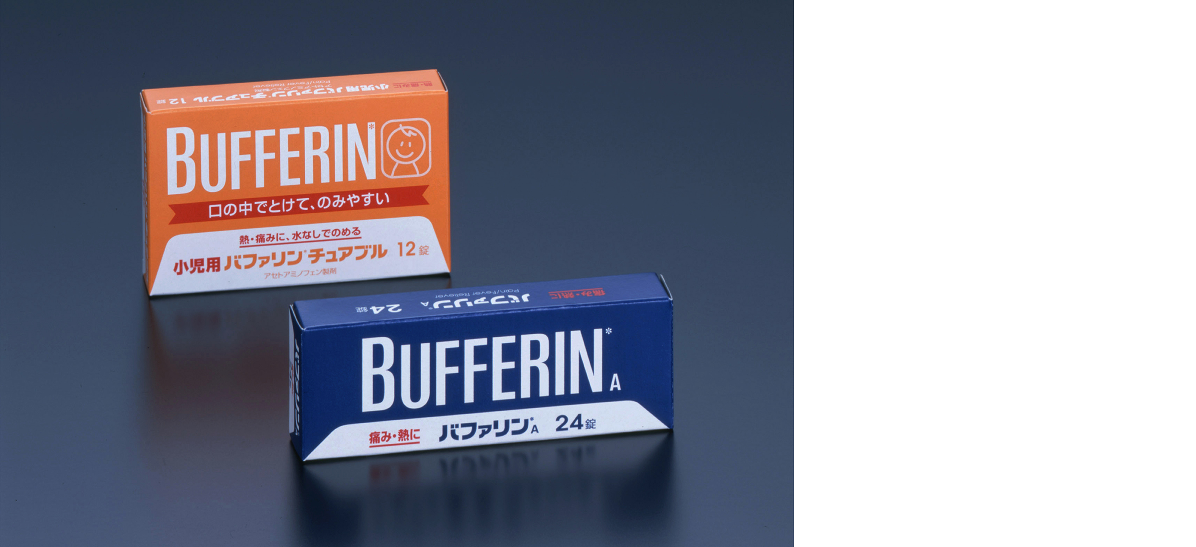
BUFFERIN, the renowned brand of pain/fever reliever, its package graphics for more than last thirty years, and re-assessment of the design was made along with the improvement of the tablets. The design is a try for decant response to today’s trend while placing importance on reputable and trust image being built to date.
After carefully examining the brand’s visual property used for many years, the layout of the logotype both in English and Japanese were changed into clear graphical expression, and the color scheme was also revised.
While updated expression was added, transition to a new design, not disturbing the familiar image at all, was implemented. Pictures here are of the introduced new design. (Gra)
→GK Graphics website
Tag
Related Works

-
Product Design
Designing for Authentic Ideas,
Aesthetic Forms and Empathic Relations -

Mobility Design
From the Joy of Moving to
Local Community Identity -

Environment Design
Enriched Relations among a City,
People and a Community -
Communication Design
Designing Connections between
People and Information -
Design Strategy
Innovation Begins with People
-

Design Engineering
Giving Shape to Non-Existent Things:
Creative Engineering

