
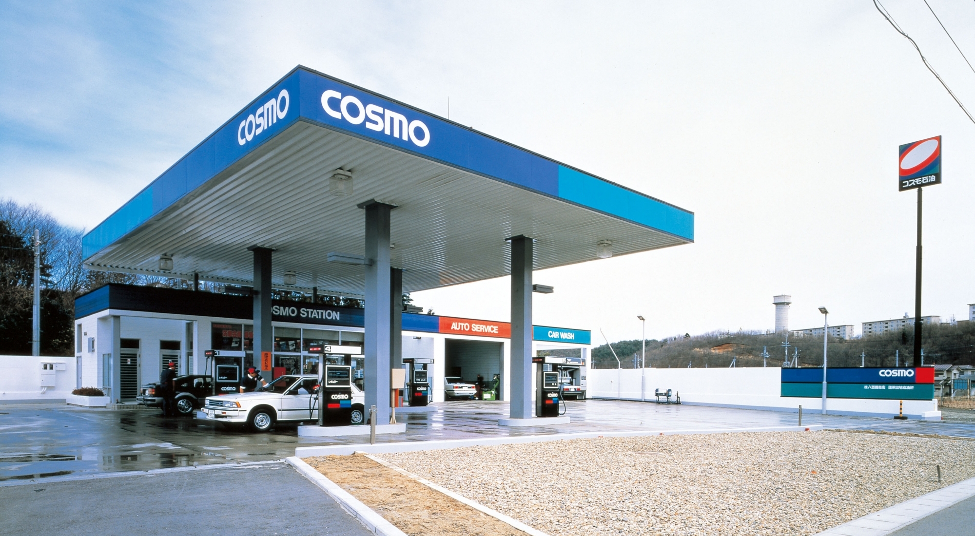
“COSMO” visual identity project
Cosmo Oil Co., Ltd.
The Visual Identity planning was for the Cosmo Oil which was the merger of the Maruzen Oil and the Daikyo Oil. Responding to times by positively and visually appealing a new brand, the planning aimed to promote business image and to respond to atmosphere of times.
The mark called “Cosmo Oval” expresses the image of the Galaxy, future, cooperation, lively motion. The color scheme called “Cosmo Prism” expresses brightness, freshness, originality with the theme of three primary optical colors. The design developed on the service station, sign pole, tank lorry alike impressed people with good sophistication when it was introduced. (Gra)
→GK Graphics website
Tag


Credit
Cooperation: Hakuhodo Inc.
-
1986 SDA Grand Award SDA Associate Award (Japan Sign Design Association)
Related Works


-

Product Design
Designing for Authentic Ideas,
Aesthetic Forms and Empathic Relations -

Mobility Design
From the Joy of Moving to
Local Community Identity -

Environment Design
Enriched Relations among a City,
People and a Community -
Communication Design
Designing Connections between
People and Information -

Design Strategy
Innovation Begins with People
-

Design Engineering
Giving Shape to Non-Existent Things:
Creative Engineering